Design School in a Nutshell
Time flies, man. It feels like a hundred years ago that I made the big decision to go back to school, and now here I am, finally graduated with a Bachelor’s Degree in Design under my belt. It’s been intense, it’s been stressful, but as I sit back and reminisce about my experiences during my four years of design school I’m truly astounded at my creative journey of where I started to where I am now.
The following is as best a recap as I could muster; there are literally hundreds of projects that I sifted through to find this batch of images, and I could talk for days about all the little bits of know-how I picked up along the way. In the interest of the reader with a relatively short attention span, I’ve condensed it to a selection of my favourite pieces, along with some choice words to help narrate my path, process, and key takeaways.
Flip through the full gallery of images at a glance here, and keep scrolling to read the full entry.


When I decided to go back to school in 2014, I was super reluctant at first to be giving up so much of my time to pursue something that most people my age had done almost a decade earlier. Was post secondary education going to be worth all the time and effort and sleepless nights and over-caffeination? Would I gain the knowledge, experience and opportunity that I knew I needed to push my career to the next level?
The answer is a resounding “hell yes.” Over the course of four years, I grew from a secluded one-man band working from a lonely home office into a part of a thriving community of designers with big ambitions for the future. I won’t lie, at times things got pretty tough and overwhelming — being the first cohort of a brand new degree program brought its own challenges for both students and faculty, but I wouldn’t trade the experience for the world. I gained a family of designers that I went into battle with every day, and four years later we’ve come out on the other side with the chops to take on the world.
What I loved most about the Bachelor of Design program at Conestoga College was the progression in focus from strategic design to entrepreneurial business throughout our classes. The first two years of BDes were comprised mostly of design theory and application, while years three and four introduced much more in-depth study of business framework and practices in correlation to the design industry. At the end of the day, this composition of courses, projects and extracurricular actives provided a robust platform from which to learn the skills needed to succeed in the world of professional design. Here’s a few of my biggest takeaways from the last four years.
Lesson 1:
Discover Your History
Early BDes courses like Visual Design, Typography, Colour Theory and History of Graphic Design really helped to solidify the importance of theory and history in my mind. I came into the program knowing my way around Photoshop, and my self-taught approach had served me pretty well in the early years of my career. That chip on my shoulder abruptly disappeared, however; I quickly learned that I had no less than one metric shitload of things I needed to learn about the practice of design before I could truly call myself anything close to a design professional. With that in mind, I cracked my knuckles, poured myself a cup of coffee and got to work.
A deep love for the history of graphic design and its many style-defining movements was awoken in me early in my time at school. Particularly through typography, commercial art, and wonderful bits of ephemera from a long gone time, this passion for old things now informs much of my work. I must have bought a hundred reference books in my first year at school—anything from authentic type specimens from the last two hundred years to my design hero Louise Fili’s collections of vintage Italian, French and Spanish shop signage. This early discovery of historic inspiration was definitely one of the strongest motivators for me in finding my own identity as a designer, and the many facets of design theory finally helped me link a “why” to the “how” in my approach.

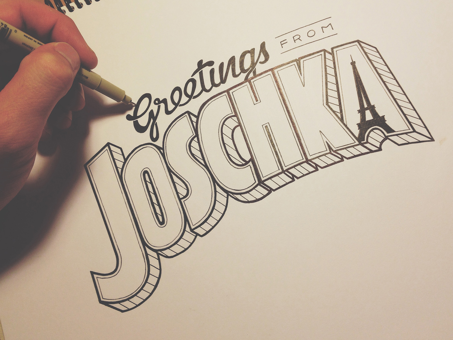
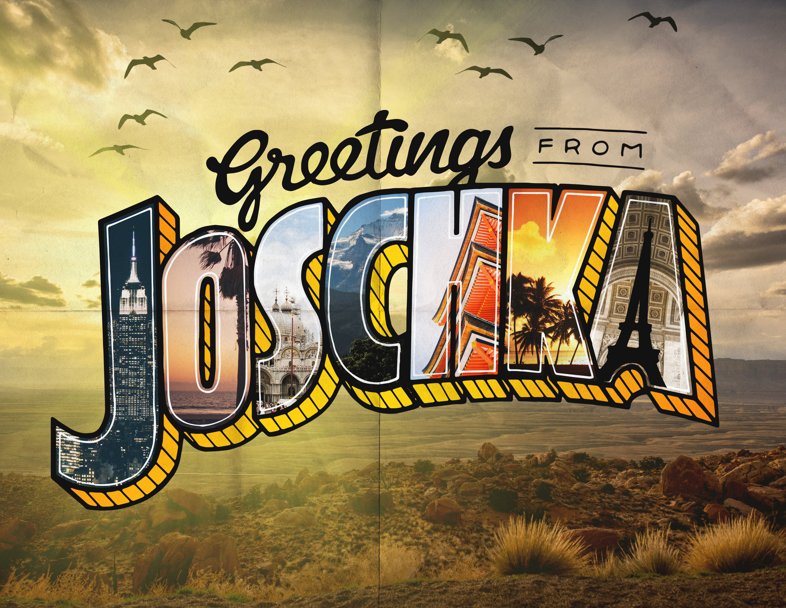
One of the first ever projects we were assigned: make use of creative typography to introduce yourself. I was just getting into hand lettering, and I thought to use the signature type of a retro tourist postcard and repurpose it to communicate something about me. I’m a designer, I love type and hand lettering, I travel a lot, and my favourite place in the world is Paris.

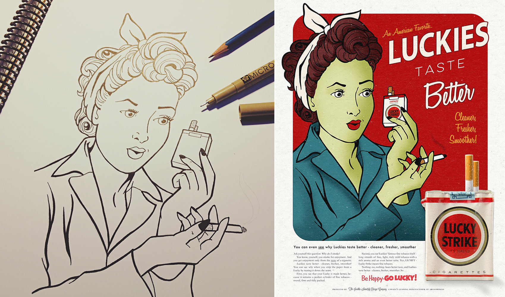
An early project for History of Graphic Design: create a product advertisement from any past decade. The golden age of advertising throughout the 1950s has always been a romanticized period in my mind, and I thought it would be fun to design and illustrate a 50s-era poster advertising Lucky Strike cigarettes. Using both analogue and digital production techniques, I combined illustration, typography and photography into a single image that references a simpler time.

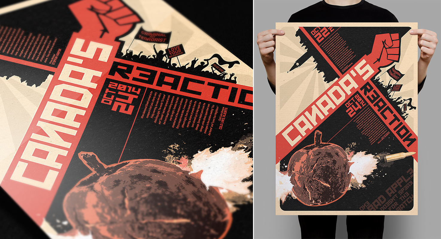
Another project for History of Graphic Design: create a historically-informed poster design that addresses a contemporary event, cause or social issue. I chose to use a layout and graphic techniques commonly found in Russian Constructivist propaganda style to call attention to the issue of gun violence in Canada, specifically that of the attack at Ottawa’s Parliament Hill in October 2014.

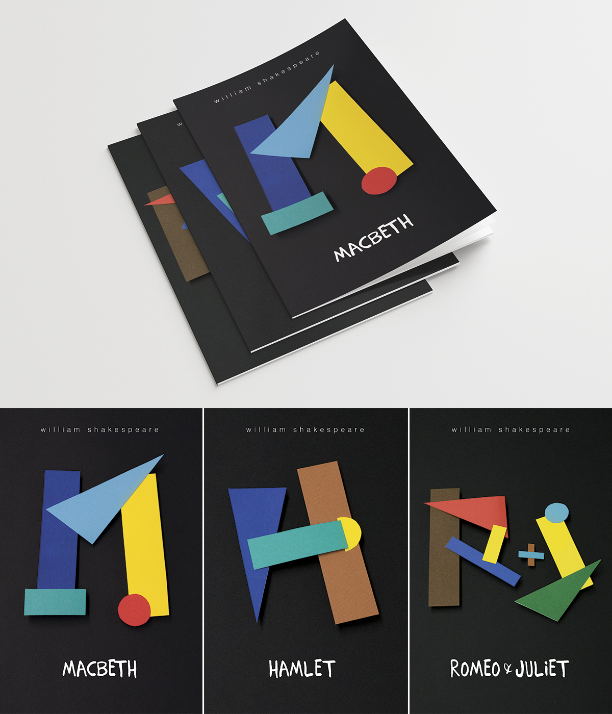
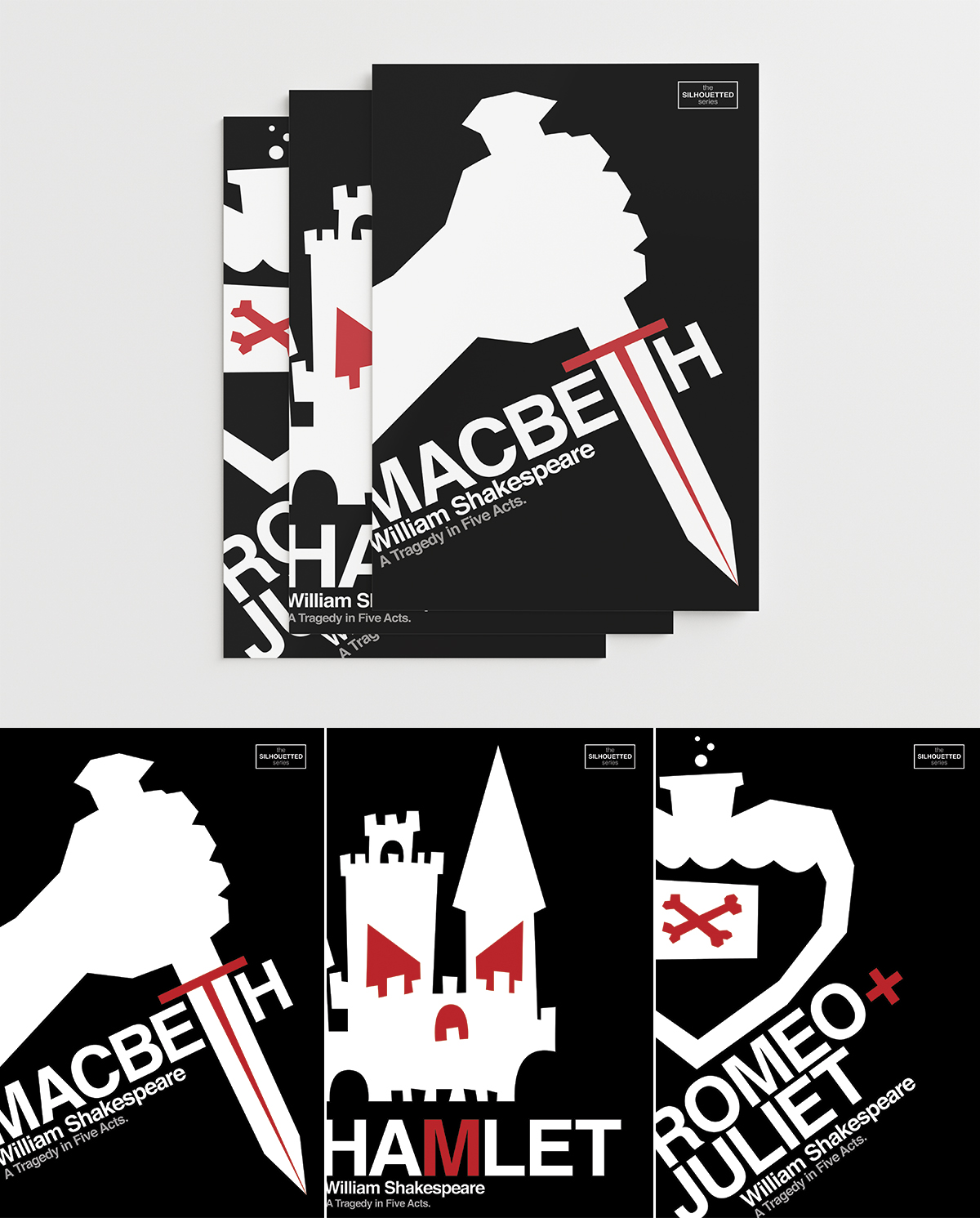
Also in the graphic vein of Russian Constructivism, I used a different, more abstract variation of the style in a set of book covers I designed for a series of three Shakespearean writings. The illustrative capitals used for each title are comprised of geometric shapes that I cut out of coloured construction paper, which I then photographed and compiled into the cover layouts. A second set was also created (pictured below) — this series used Saul Bass’ 1950s movie title sequence designs and Swiss Modern typographic treatments as inspiration to drive the stylized vector illustrations of the three Shakespeare plays.


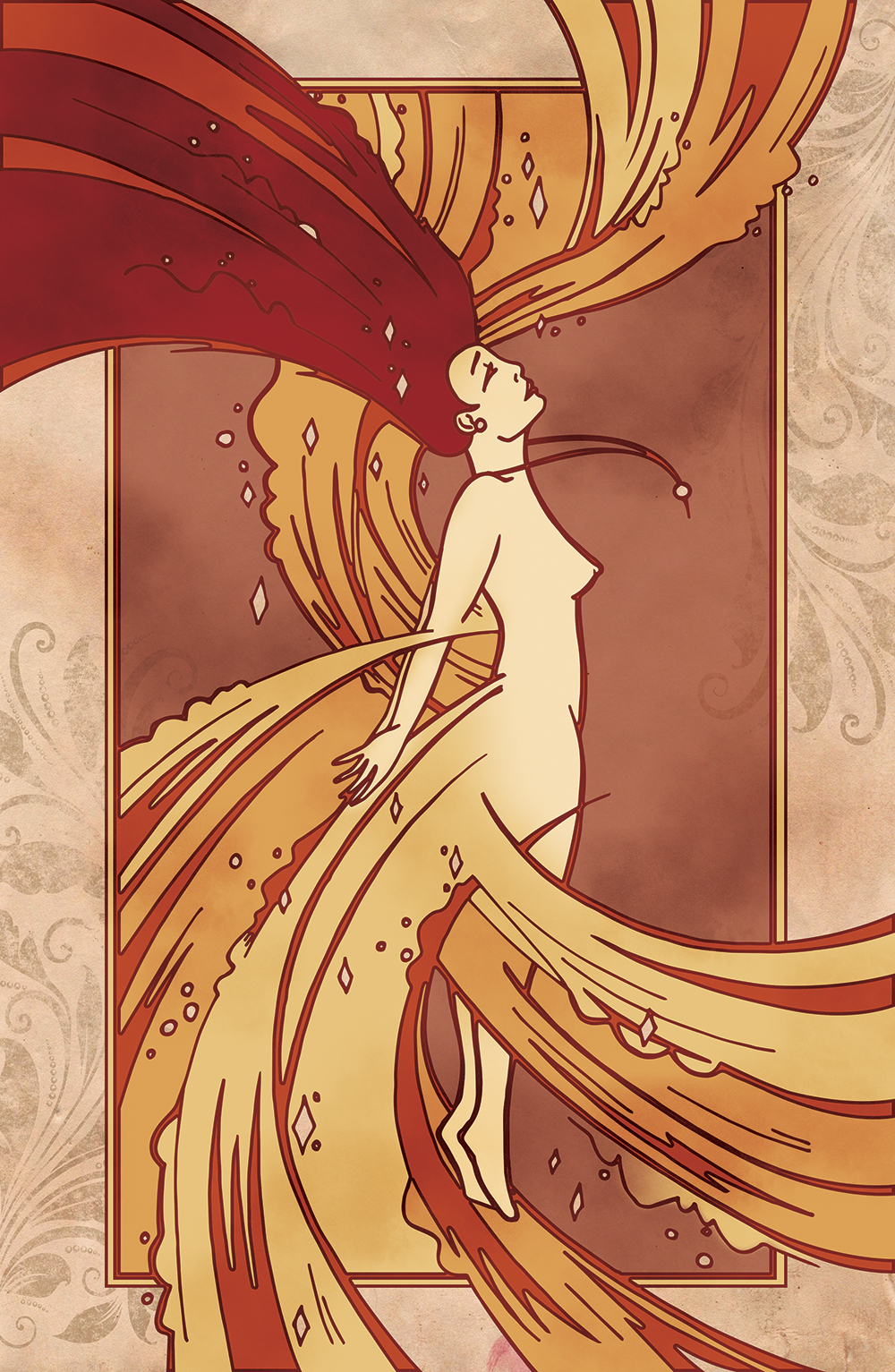
An exercise for Drawing class: create a flat black and white line drawing by hand, and bring it into a digital environment using colour, texture and dimension. My illustration explored the organic forms and warm colour palette of Art Nouveau design through a whimsical illustration of a fairy in transformation.

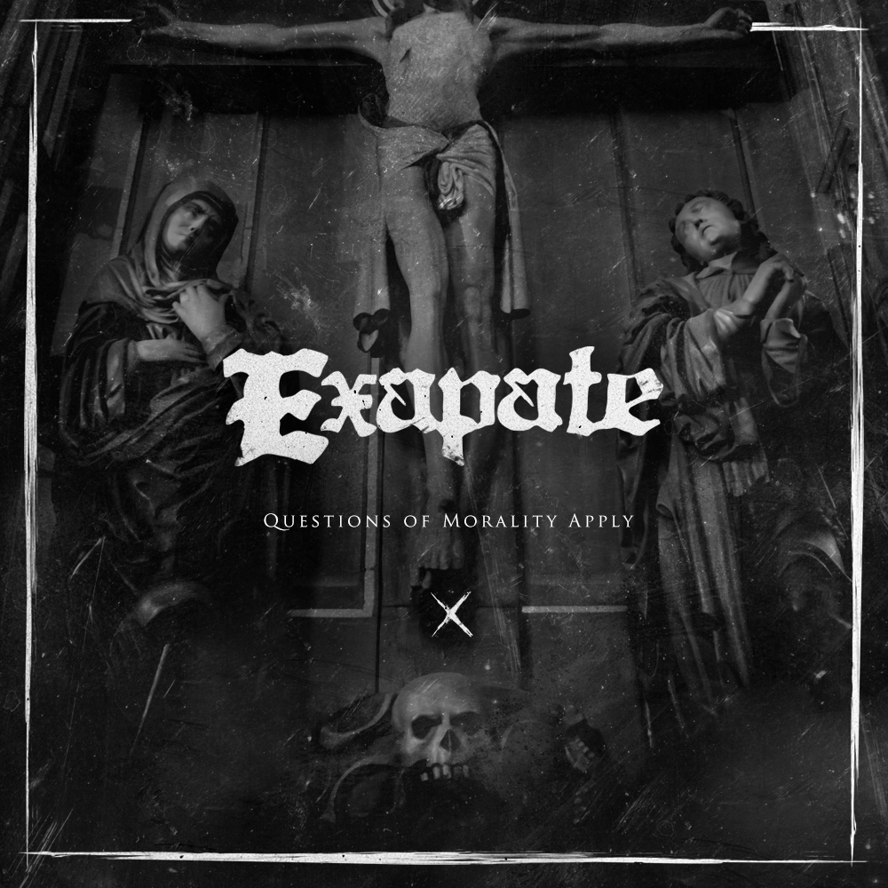
A small assignment for Typography class: use provided wording (mine was artist: Exapate — title: Questions of Morality Apply) to create an album cover design that displays an emphasis on typography. To me, these names clearly sounded like a super heavy metal band, so I cooked up a cover design that helped to speak that same graphical language. The band logo was illustrated by hand using Gothic letterforms, and was combined with photographic and layout components to form a really dark and gritty design.

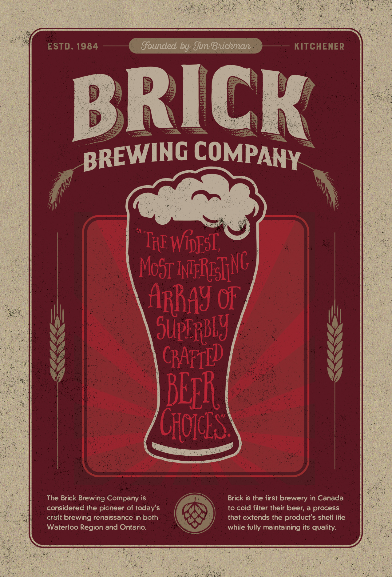
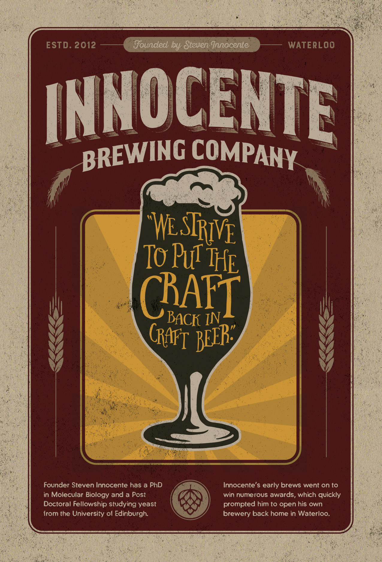
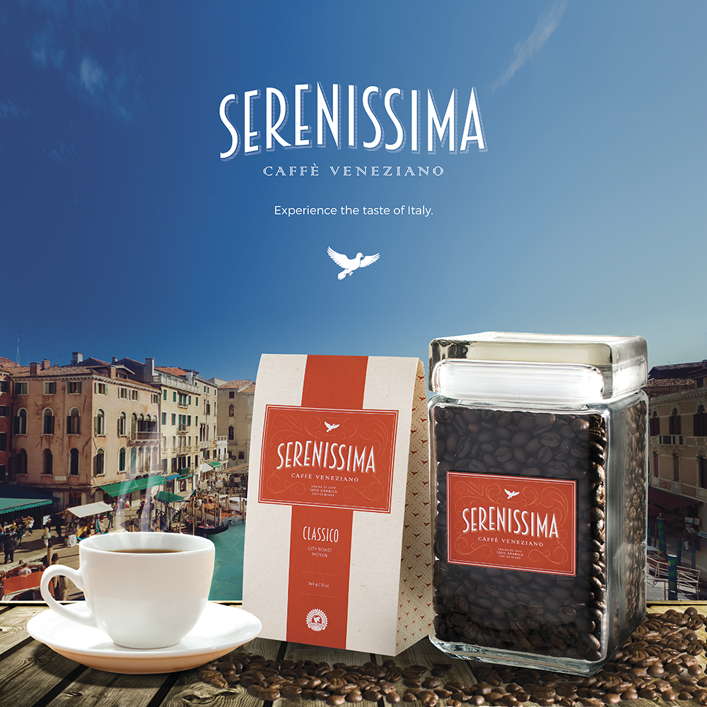
In second year I was given the challenge of creating a packaging design that used sustainable materials and production techniques. Again referencing my love of history in design, I used typography and patterns signature to the Art Deco period to create the packaging designs for a fictional Italian coffee company I called Serenissima. Inspired by the origins and influence of the beverage on European culture, Serenissima’s packaging tells the brand’s story through elegant graphics printed on 100% post-consumer recycled paper and thick, reusable glass. The goal of the Serenissima brand identity and packaging designs was to combine quality, elegance and sustainability into a contemporary customer experience that reflects the passion surrounding the product's history.
Lesson 2:
Know Your Type
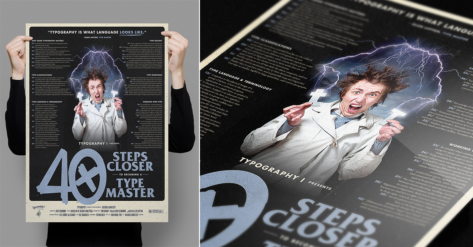
The great Ellen Lupton states that “typography is what language looks like.” If you’re a designer and you don’t know who Ellen Lupton is, do yourself a favour and pull up that Google machine and figure it out. I see typography as one of the most integral components to a design, and certainly the vehicle I use most to get my point across in my work, pretty much regardless of what I’m designing. I’ve realized that I’m a massive type geek, and school definitely helped ingrain that into my psyche. From anatomy to hierarchy, kerning to classification, I absolutely love this stuff.

An early assignment for Typography class: design a poster that states Ellen Lupton’s 40 rules of better type. Man, that’s a lot of letters.

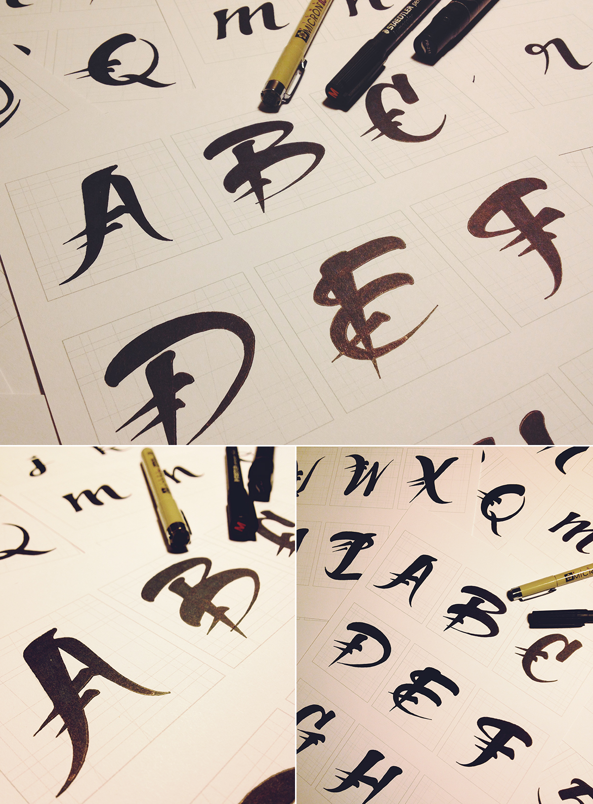
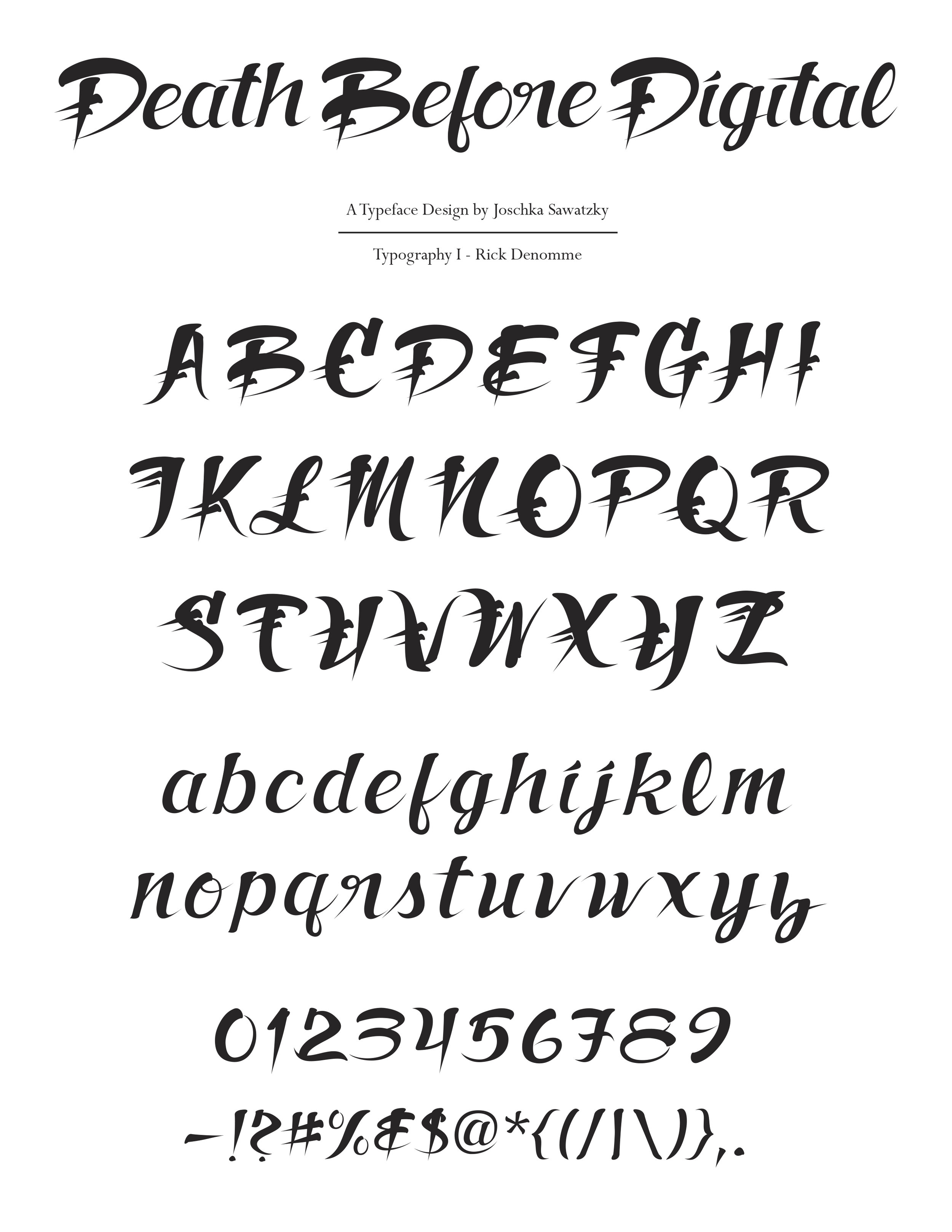
This one was a doozy. The project called for a full typeface design (including upper and lower case, numbers and punctuation). I used this project as an opportunity to practice working with a brush pen — something I had dabbled with in the past, but never really pursued much due to being left-handed and seemingly inept at drawing proper calligraphy. About a hundred pages of scribbles were compiled, scanned and digitized to form Death Before Digital, my first attempt at a full custom typeface design. Looking back, I absolutely hate this type and would never actually use it in a design, but hey—it’s kind of cool to see where about 60 hours of work ended up.

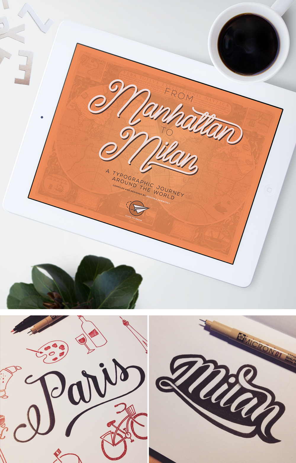
Bits of an e-book design that I put together in first year. The digital compilation included numerous articles about different styles and approaches to typography around the world, and featured hand lettered treatments of each city discussed within the articles.

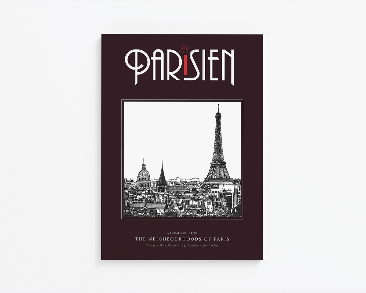
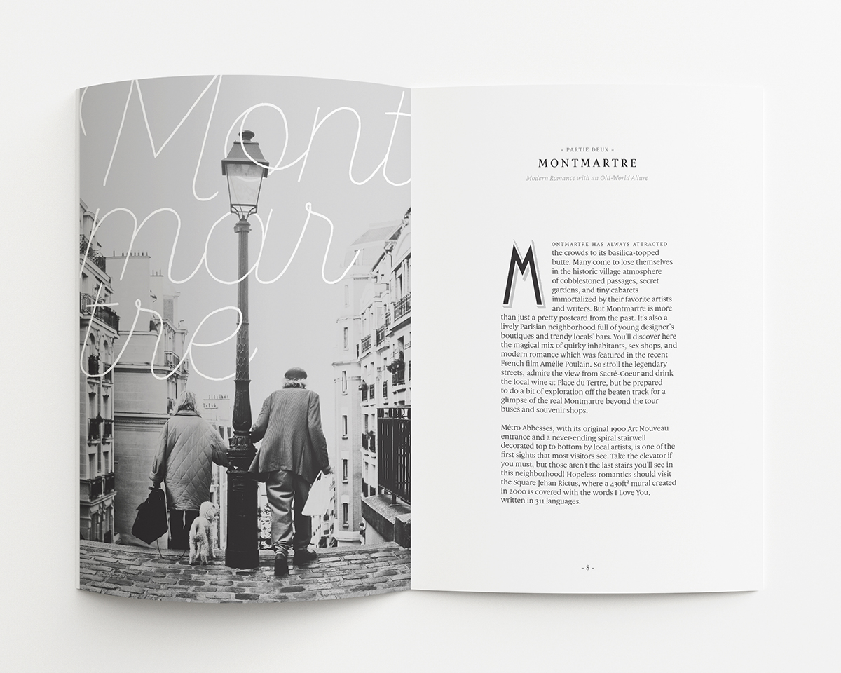
In case I haven’t made it crystal clear by now, I love Paris. My love of type sort of goes hand in hand with my favourite city — in second year I designed a guidebook that featured three of my favourite Parisian neighbourhoods, and typography was a big driver in how I conveyed a feeling of romance and nostalgia within the layout.

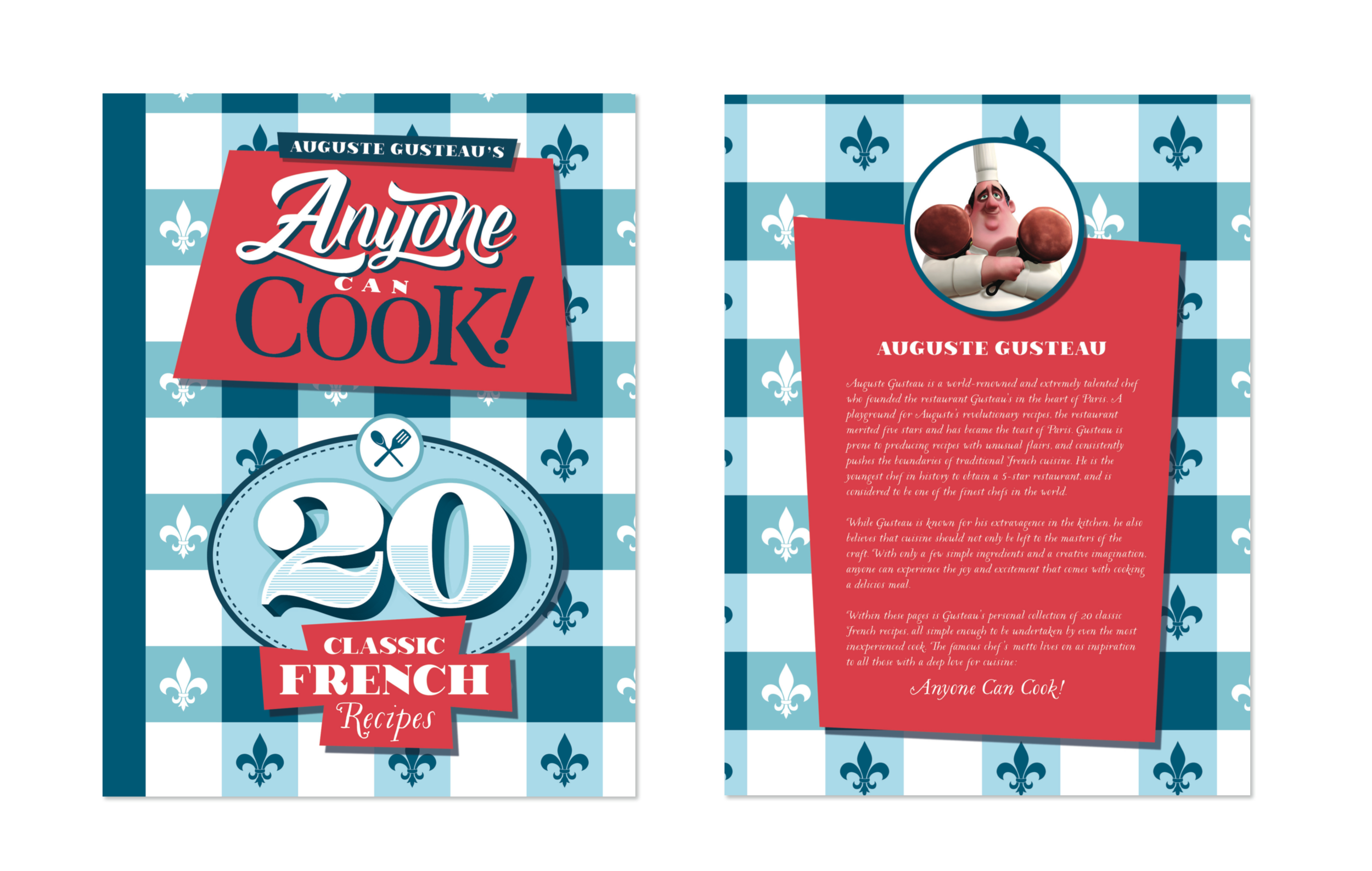
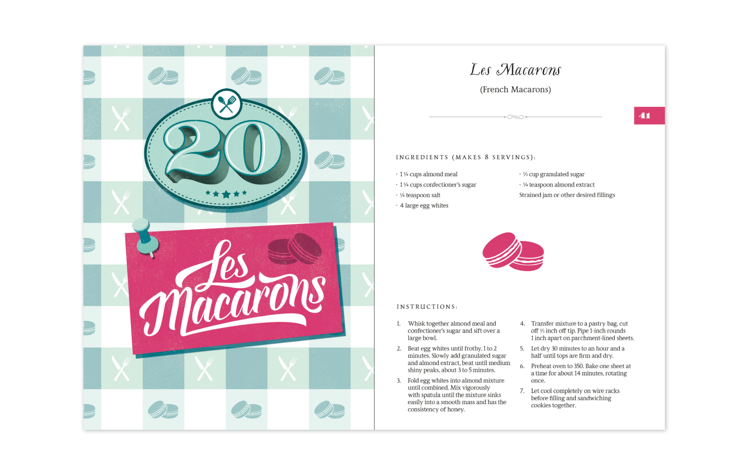
A two-page spread from a cookbook I designed in second year. My favourite movie is Disney/Pixar’s Ratatouille, and I thought it would be fun to recreate an actual version of ‘Anyone Can Cook’, Chef Gusteau’s famous book of classic French recipes. The book employed a lot of illustrated type, as well as a strict hierarchy in order to lay out the high volume of information in a neat and comprehensive way.
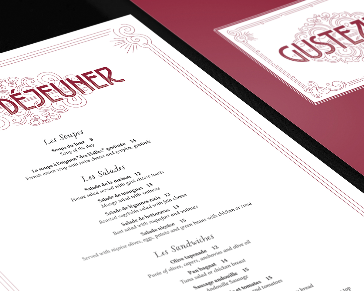
The Ratatouille-inspired project sort of evolved over time with the introduction of additional assignments as part of the same general theme. Gusteau’s cookbook became a multi-page menu and wine list for the chef’s fictional restaurant, complete with an animated logo (which took me a very gruelling week of sleepless nights to learn in After Effects).

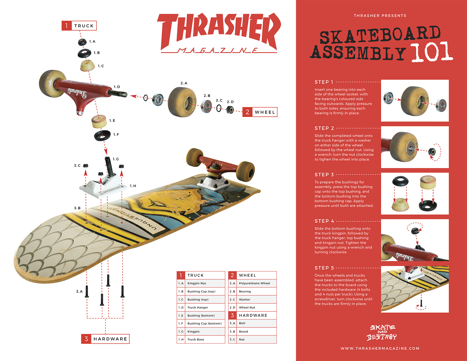
Speaking of type hierarchy, this one was also a big proponent of strength in letters. Although the composition and design is more modern and technical than my usual style, this poster uses type and diagrams to illustrate the setup of a skateboard. As a big aficionado of historic type and hand-rendered designs, I need to make sure I also always consider the importance of proper execution when working with more contemporary fonts and digital design.
Lesson 3:
Expand Your Toolkit
Looking back on my frame of mind before I started school, I’m the first to admit that I was overly confident despite being under-experienced, particularly in software and industry-standard practices. I worked as a designer for a small local magazine a few years ago, and every month I’d design the entirety of the 30+ page printed publication in Photoshop. PHOTOSHOP. For layout design? Are you kidding me?? Thank God I figured my shit out and learned how to use InDesign. And Illustrator (properly). And a bunch of Adobe’s other design-forward software. Oh, and I bought a camera too.
This experimentation outside of my comfort zone began in school as I introduced a camera and greater understanding of software into my workflow. From staged studio shoots to on-location photo essays, photography and post-processing became a huge part of my methodology at school and continues to be today. Filmmaking and video production came naturally as the next frontier for me to explore, and the projects that I worked on at school really helped me to overcome my intimidation when working with new tools, software, and creation techniques.

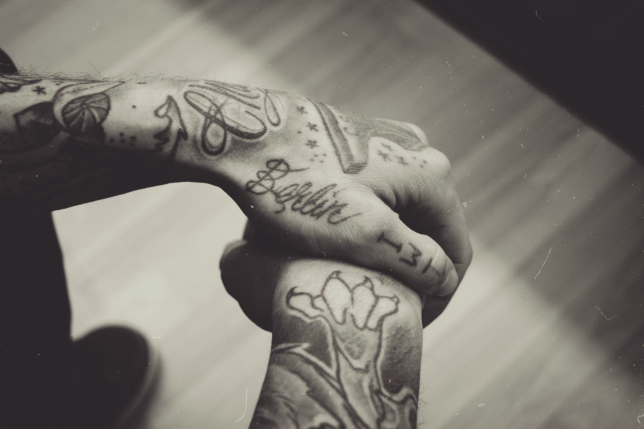
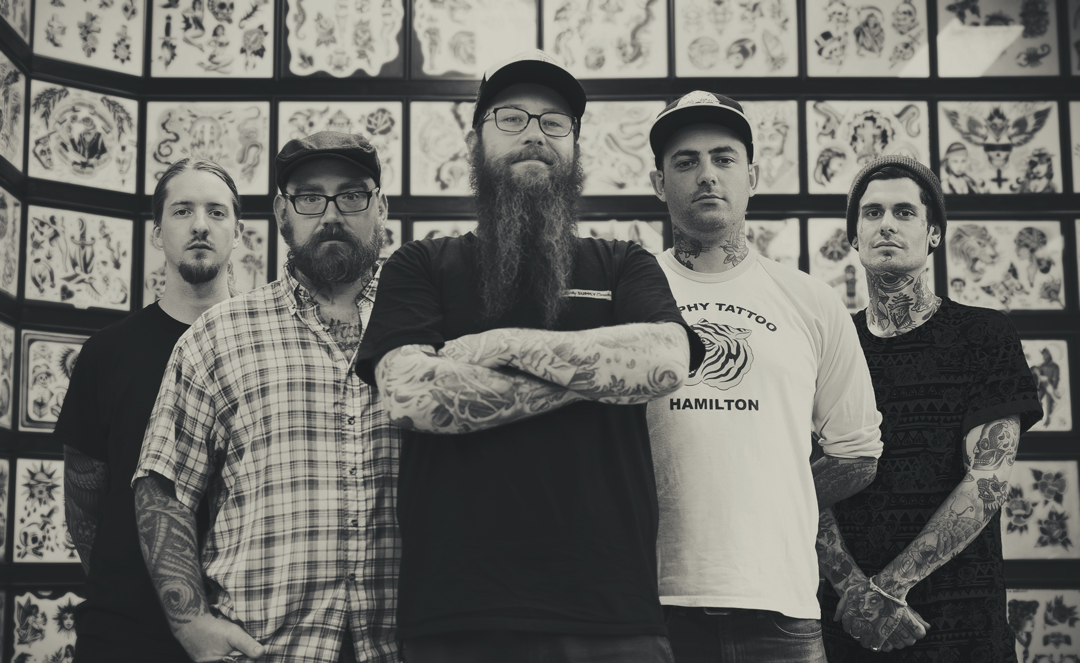
For a photojournal project in first year, I posted up at my favourite local tattoo shop Berlin Tattoo to capture a series of photos covering daily life at the shop. The collection included a series of candid shots along with portraits of the guys in front of their flash wall.

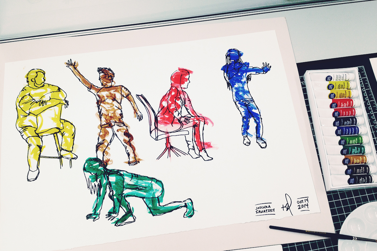
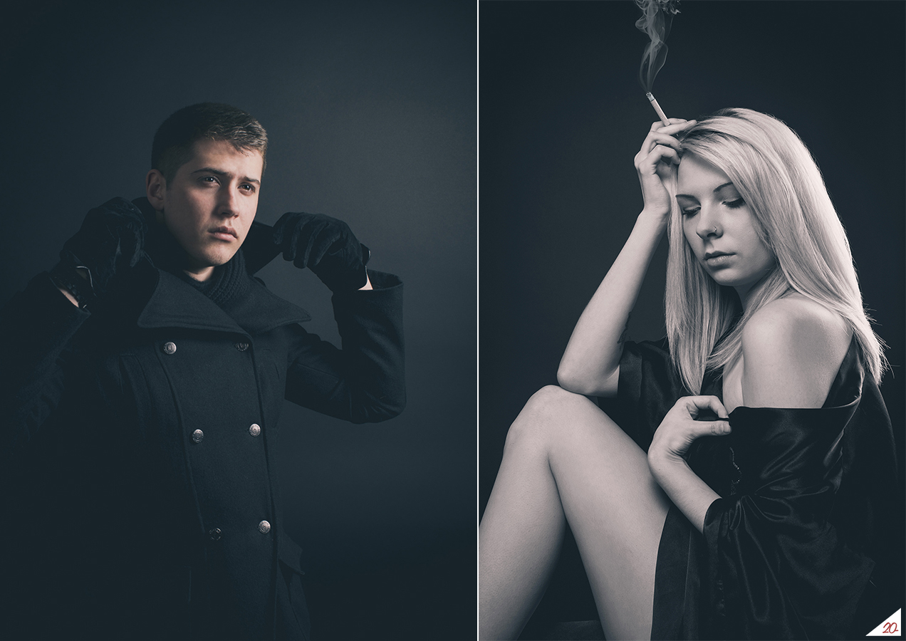
Once I had gotten my head around how a camera works, the next step was to move into a photo studio setting with controlled lighting, staging and subject posing. Early assignments featured my classmates as subjects for photos that explored different lighting techniques.
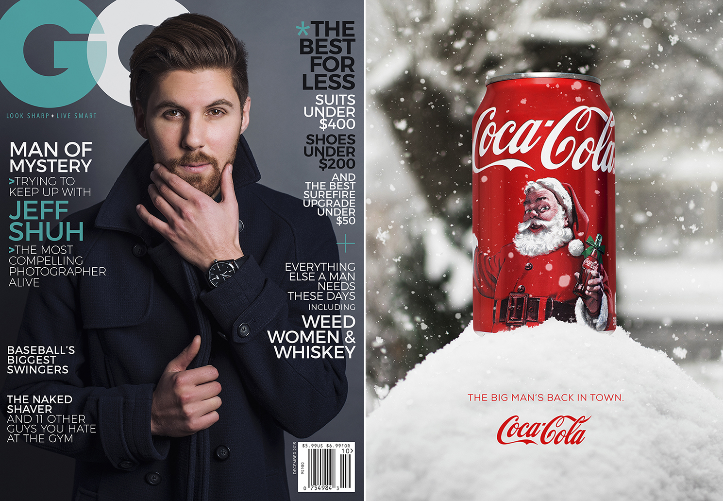
Assignments eventually evolved from studio portrait shoots to photography-based magazine ads and covers. I had my friend Jeff in for a studio session to capture the photo for a GQ cover design (believe it or not those article names along the sides are actually from a real GQ issue). For the Coca Cola ad on the right, I grabbed a can from the vending machine at school, shot it in the studio and combined the image with a photo of a snowbank outside my parents’ place.

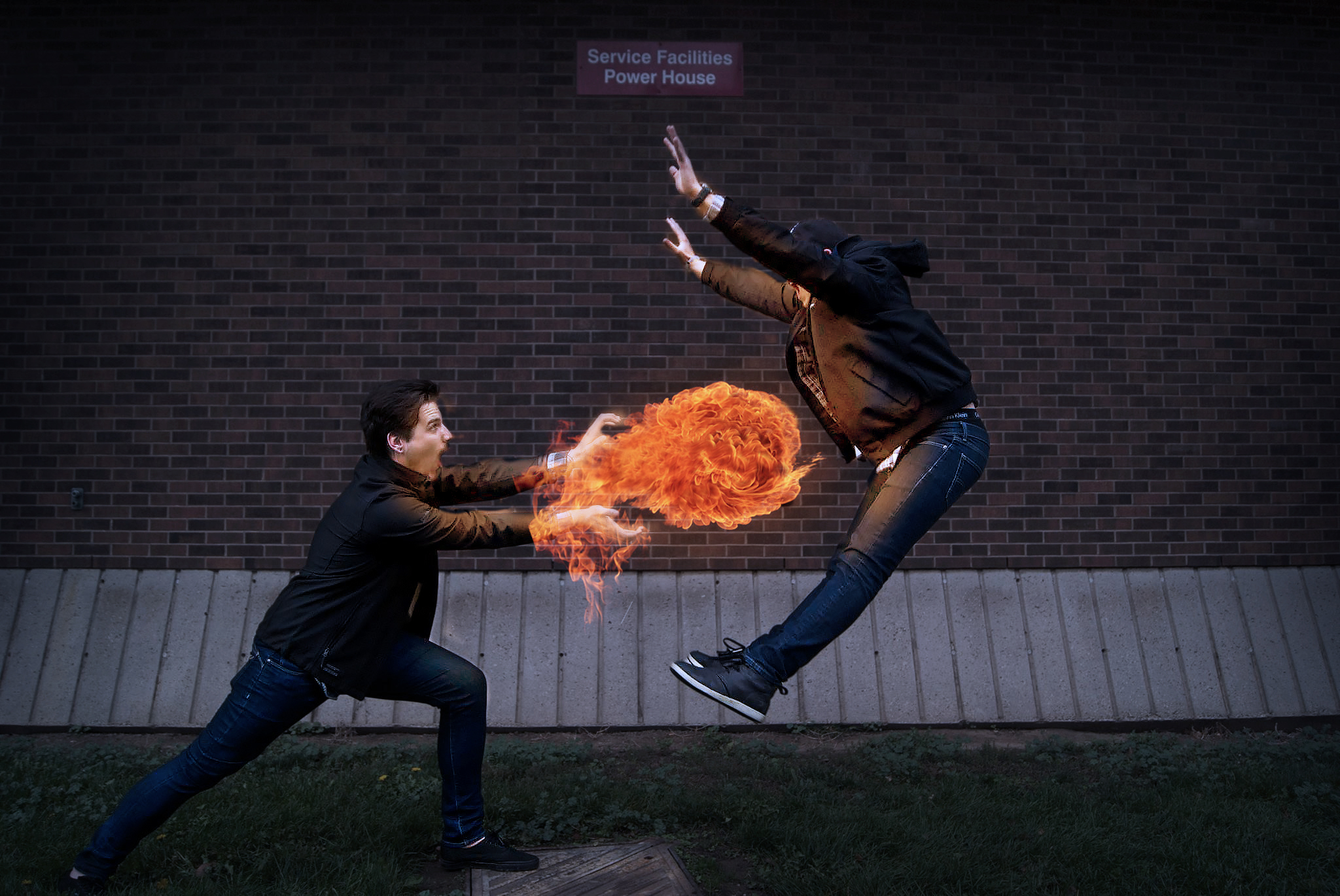
Having some fun with Photoshop. For this one I set up my camera on a tripod with a timed shutter release, told my buddy Andrej to jump, and inflicted some Street Fighter-style damage.

An exploration of juxtaposition using double exposure photo blending techniques. These images mixed the shapes of trees and gnarled branches from photos that I took in my backyard in the dead of winter with the vibrant colours of beautiful beach sunsets in photos that I took in California.

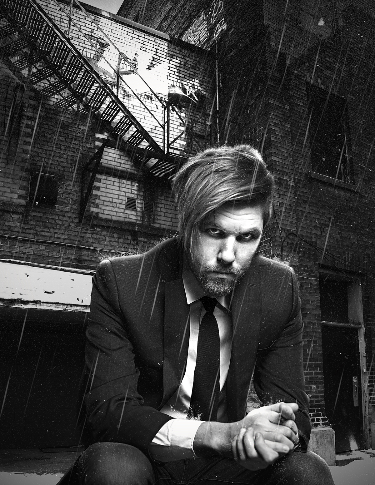
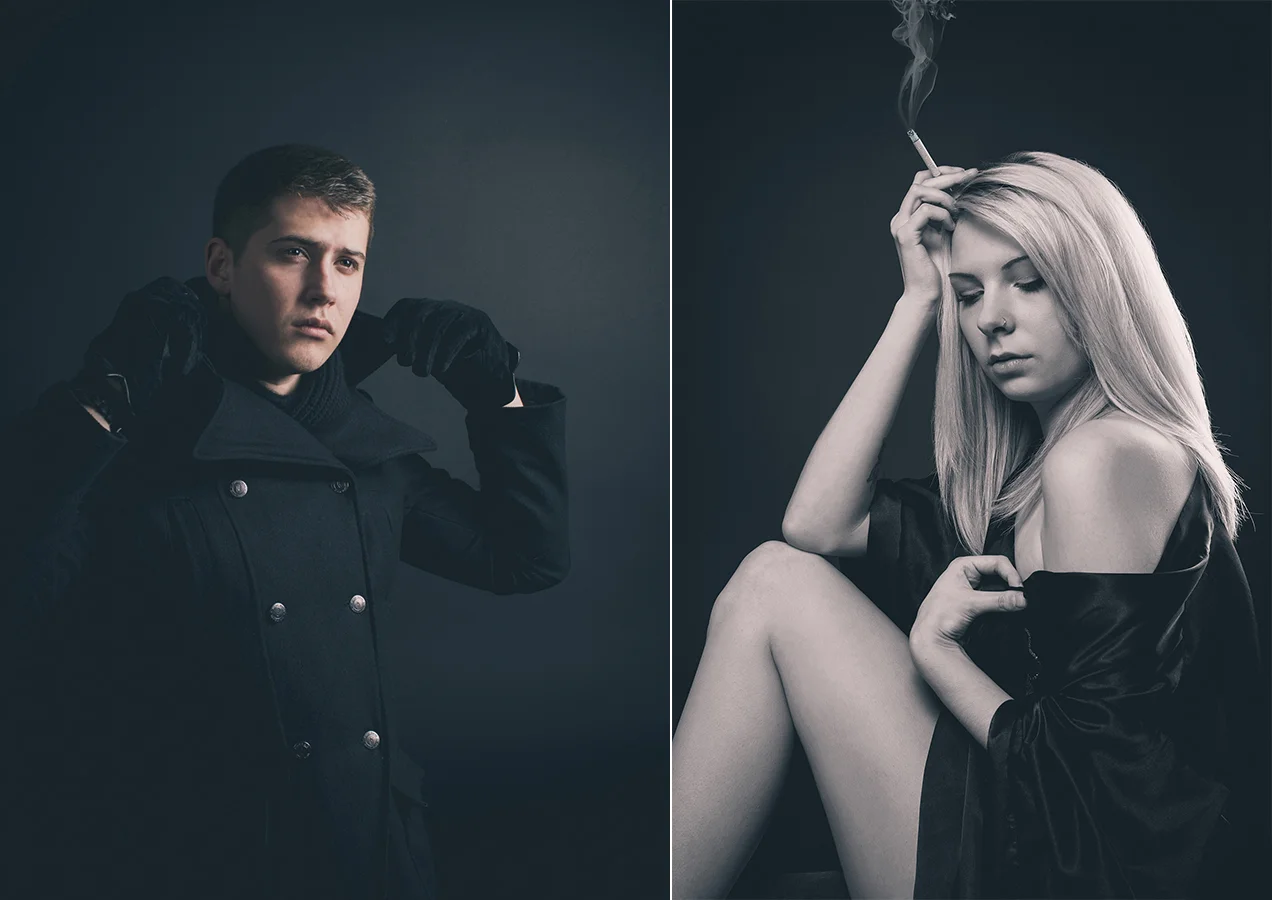
This one used a labour-intensive post-processing technique where I combined a studio portrait of Jeff with a shot of a back alley in Downtown Kitchener. All of the rain and water textures were added afterwards in Photoshop in combination with a black and white HDR colour grading effect to give the image a super gritty Sin City vibe.
Lesson 4:
Always Seek Opportunity
I’m a big proponent of the idea that what you put into life is what you get out of it, and this thought rang as true as ever for me during my time at design school. I treated my school projects with the same dedication as I would any client project. As often as I could, I would actually incorporate client work into my school projects, which gave the work an additional level of importance above and beyond that of a grade on my transcript. If the project brief called for deliverables that I felt could be applied to something in the real world, I’d jump at any opportunity to get my clients involved.
Being introduced to the RGD (Association of Registered Graphic Designers) was another huge factor in my wealth of opportunities during school. Attending the annual DesignThinkers conference in Toronto every fall opened my eyes to the amazing community surrounding the design industry in Canada, and I’m proud to be an ongoing member of the association as a Provisional RGD.
I was also fortunate to come into various opportunities to travel as part of my education. From visiting top-tier design agencies and studios in New York City to photographing the streets of Tokyo and Shanghai, these experiences really made me realize how much I could get out of school if I went the extra mile.

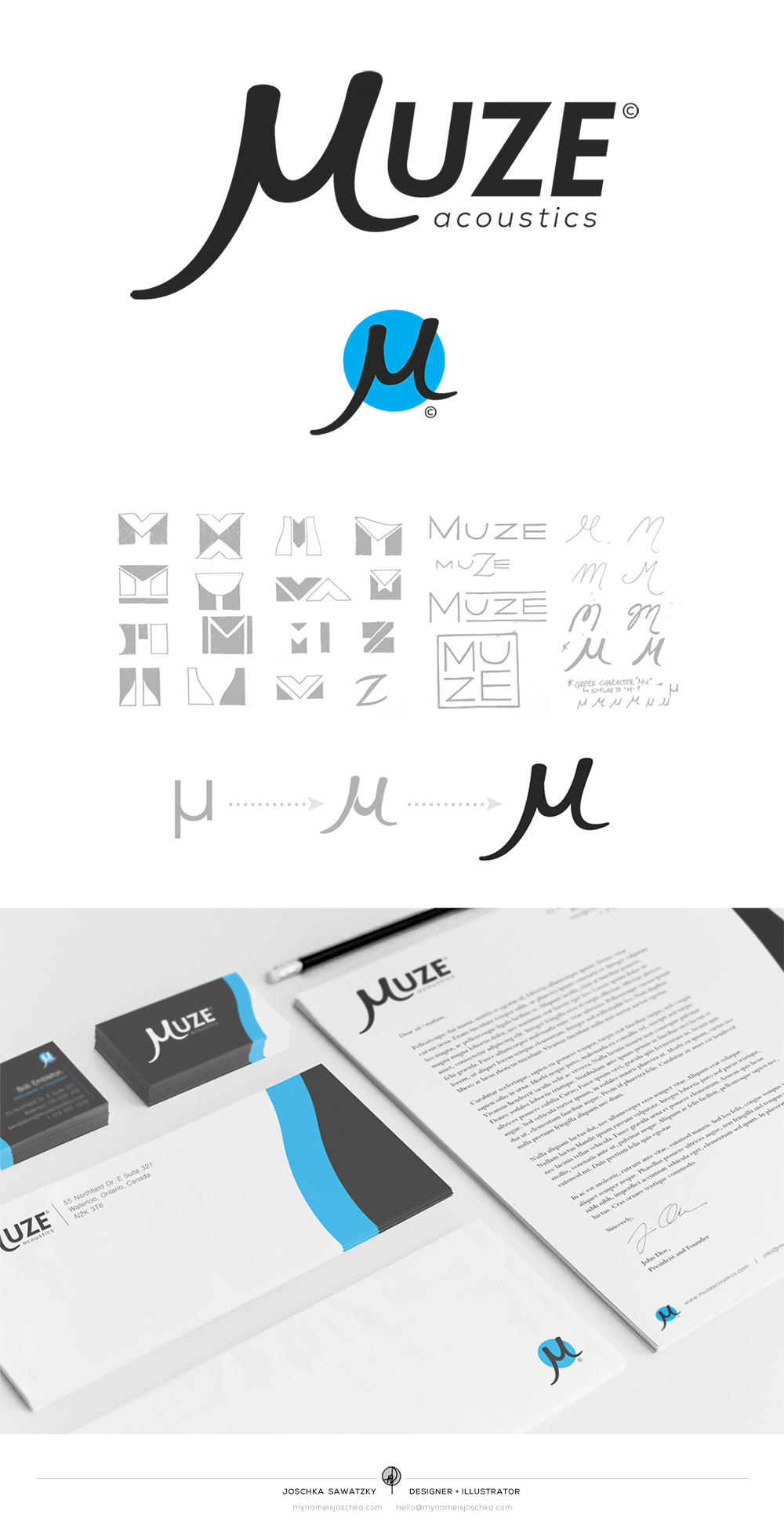
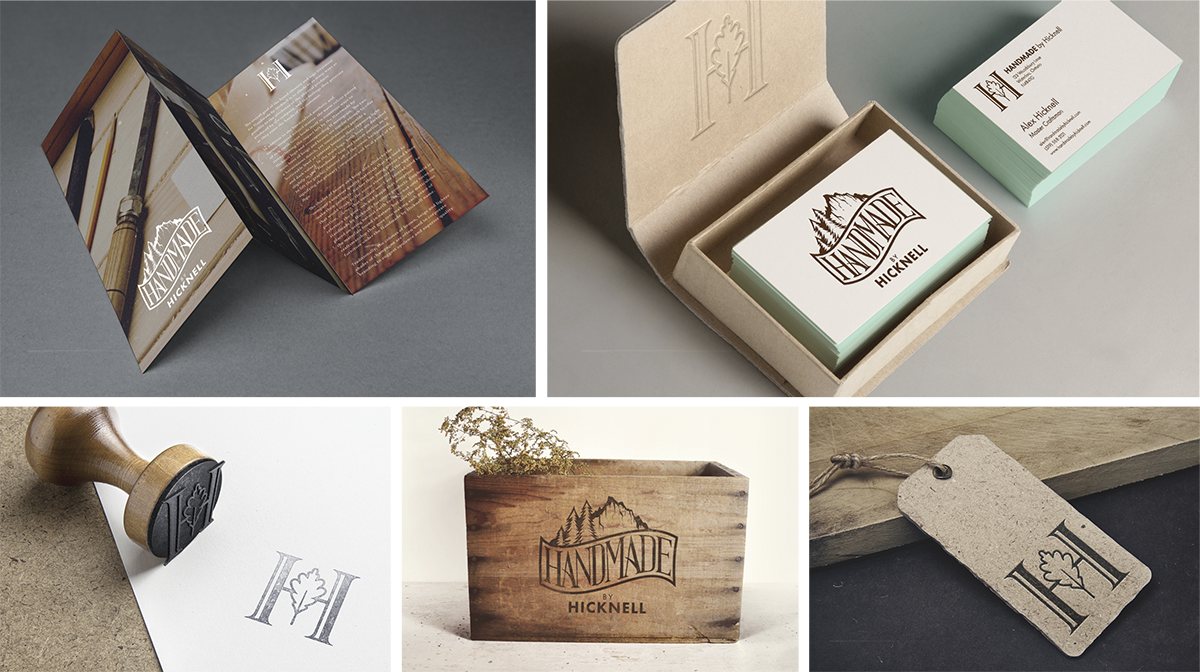
My initial concept sketches for a full brand identity development project in first year. The massive project encompassed three classes (Visual Design, Typography and Colour Theory), and I chose to use it to develop a new brand for my friend Alex’s custom woodworks company Handmade by Hicknell. Final designs are shown below.
Video lookbook for Speechlust Jewelry's 2016 Men's Collection. My friend Courtney runs Speechlust (which I also designed the brand identity for in 2015), and when she told me that she was releasing a mens’ collection I jumped at the opportunity to create a video as part of a school assignment.

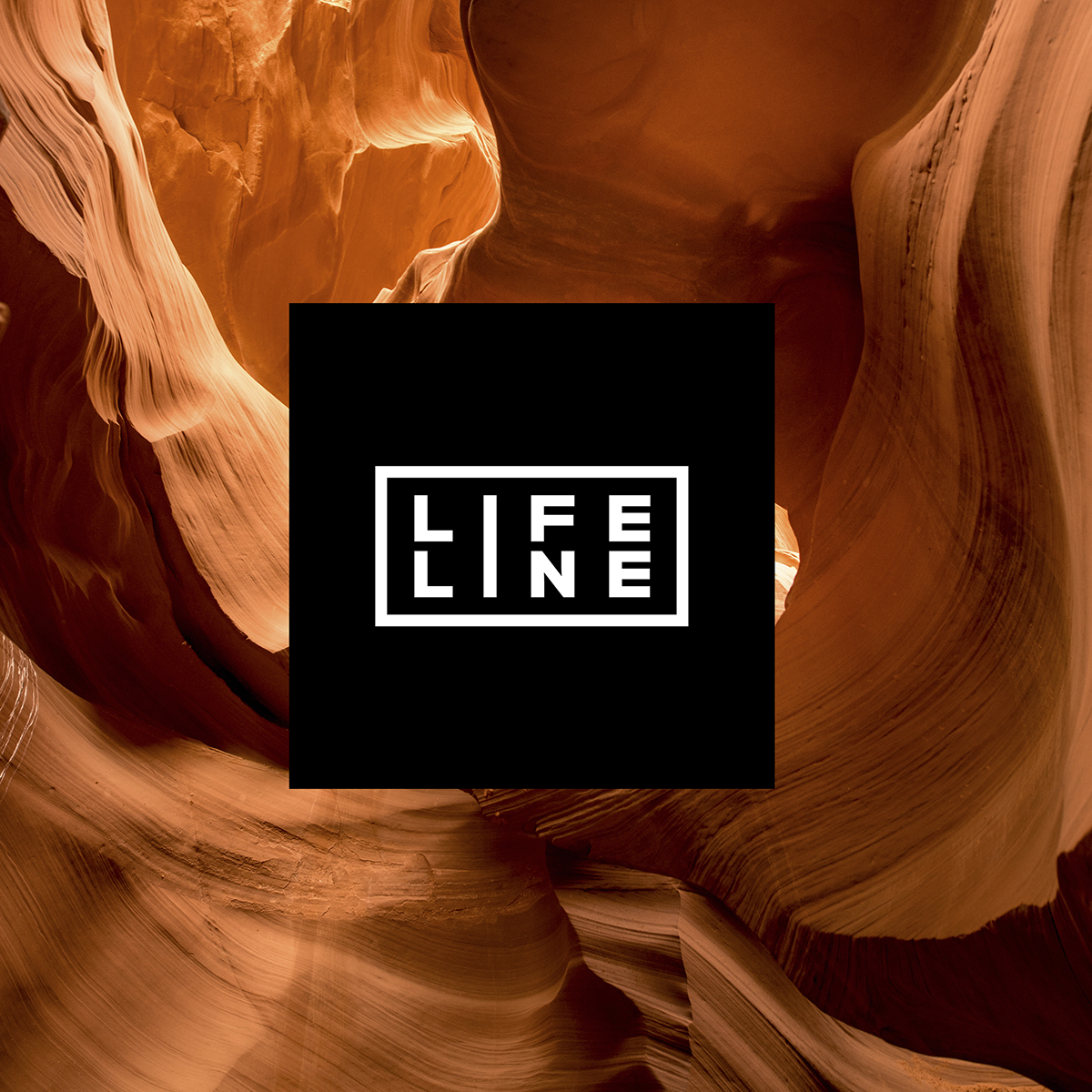
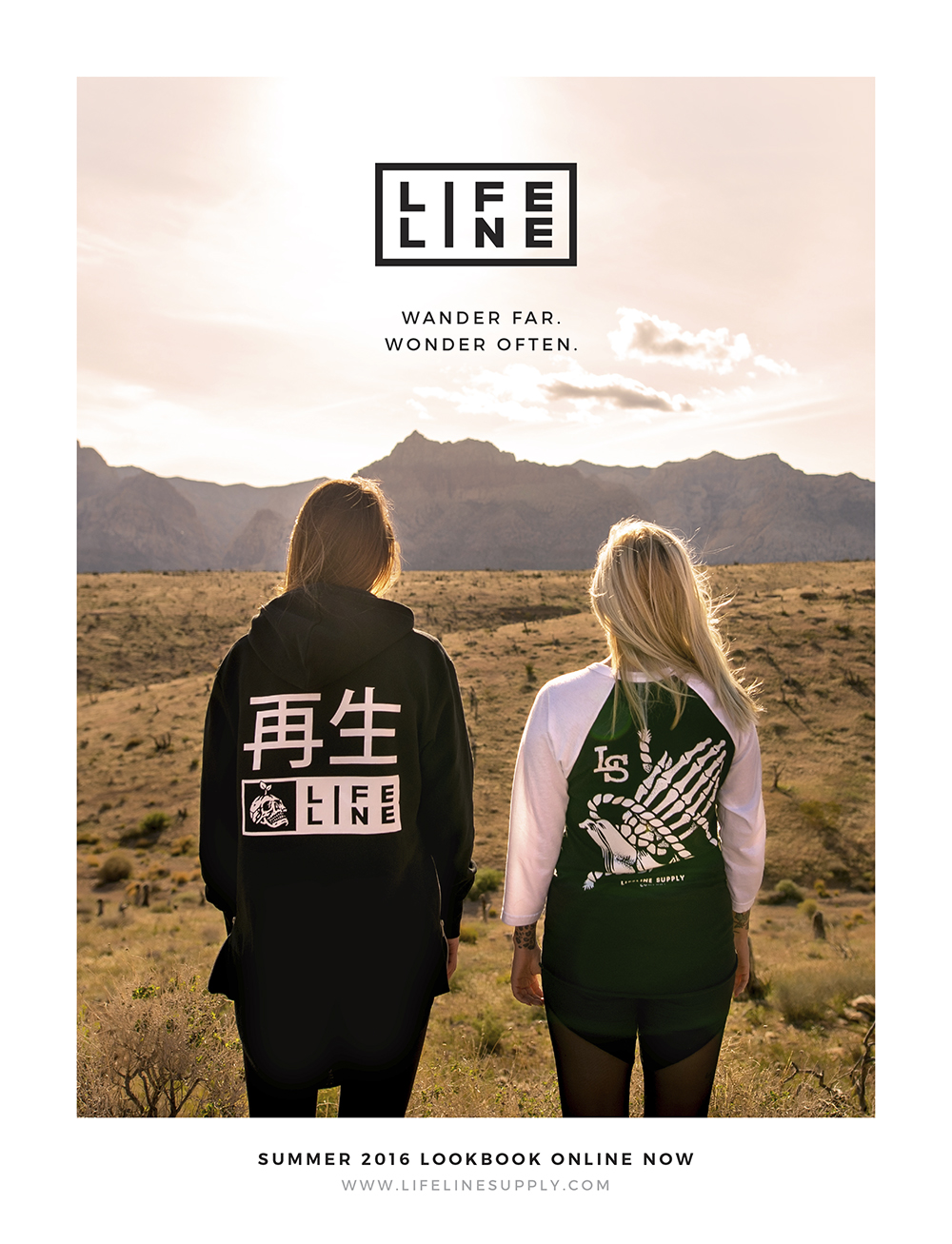
I won’t go into too much detail on this one yet (saving it for a future post where I’ll have more room to blab), but in second year I designed and launched a clothing company called Lifeline Supply as part of a project for my Branding class. The brand has become a big part of my design life, and I went on to focus my final Design Thesis around it. More on that soon.
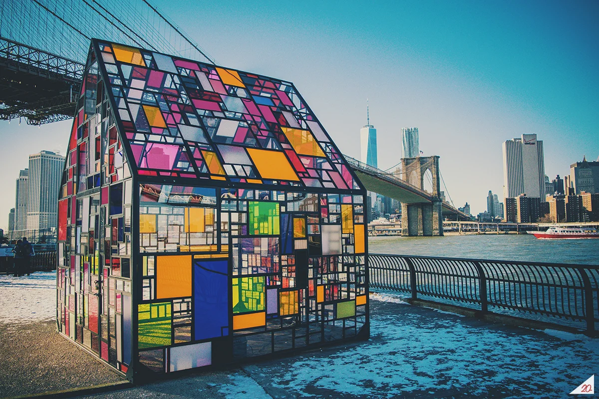
One of my favourite photos from my first trip to New York City in 2015. It was like -35 degrees that day and I had the bright idea of walking from upper Manhattan to Brooklyn, stopping periodically along the way to snap photos and warm up in more than a few Starbucks. Worth it. The next day we visited Pentagram and Sterling Brands — it felt like I was walking on holy ground at both studios (what designer wouldn’t when you’re literally standing in Paula Scher and Michael Beirut’s offices).

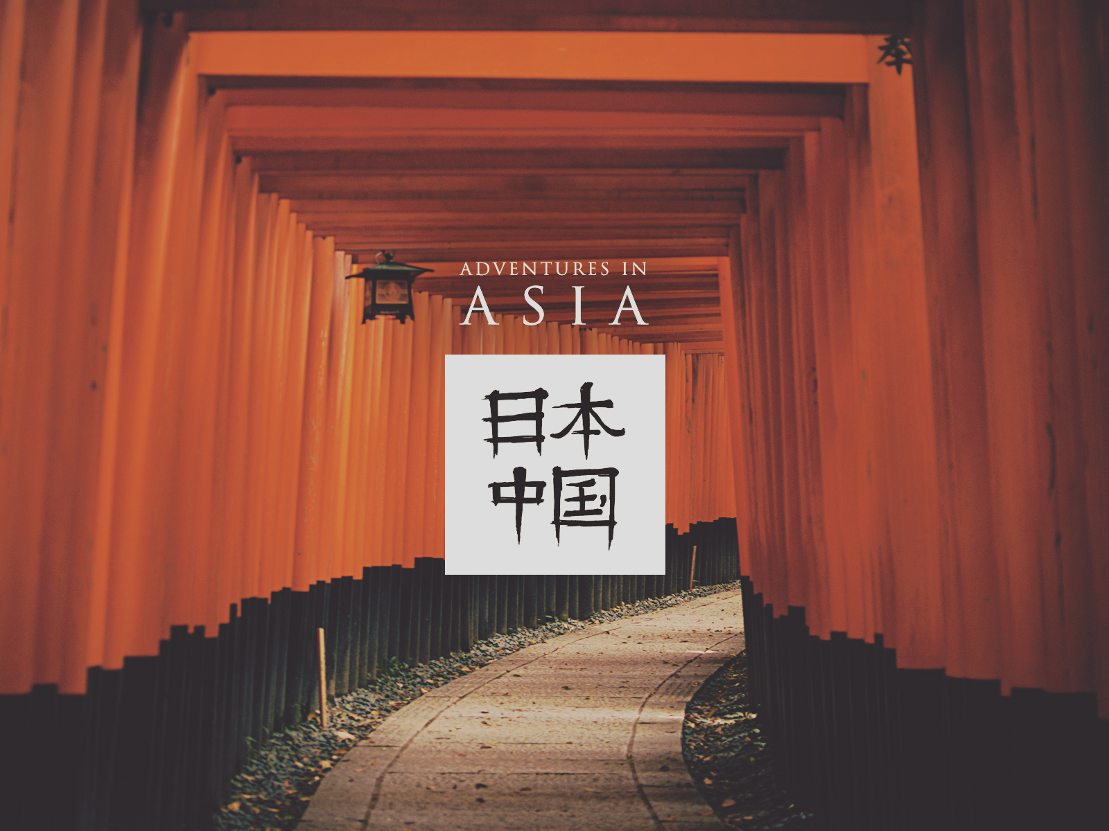
I took this photo while visiting Suzhou, a city in China about two hours west of Shanghai, as part of an Overview of Asian Cultures elective class in second year. I wrote a series of short essays during my three weeks in China and Japan, and coupled with taking a ton of photos, the experience really made me think more deeply about culture and the vast difference between East and West. Also, Kyoto totally stole my heart (the part that wasn’t already taken by Paris).
Okay, if you’ve made it this far, I wholeheartedly congratulate you on your commitment to reading my ramblings. I find that writing helps me sort out all the thoughts bouncing around in my head, and my experience at school was certainly one that deserves some verbal and visual reflection. I learned a lot over the past four years, lost a ton of sleep, made a bunch of good friends, drank at least three times my weight in coffee, and graduated with a real sense of accomplishment and excitement for the future. I’m crazy thankful that I was able to take this journey, and hopefully my experience leaves a few nuggets of advice and inspiration for anyone on a similar path. Can’t wait to see what comes next—until then, keep it real and thanks for reading.
— J
Nov. 17, 2018