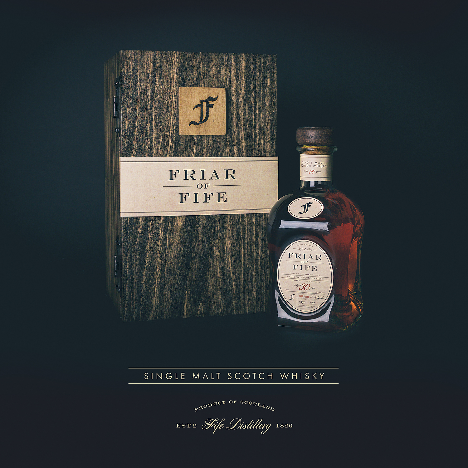
Friar of Fife
The History of Scotch Whisky: From Imagination to Fruition
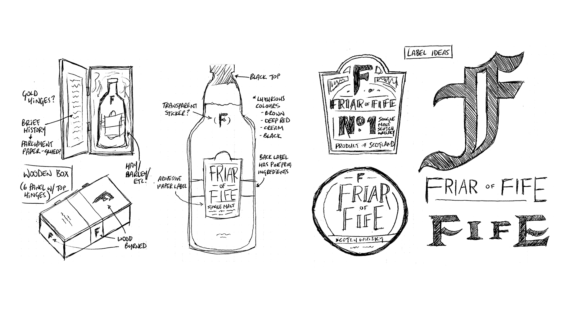
Designing for print and packaging is by far one of my favourite areas in the field of graphic design. There’s something magical about being able to see and feel something in real life that began as a few concept sketches and evolved into a tangible product.
One of my projects in first year design school was to design a package for a product, and then produce a physical mockup of how it would look in the real world. I always thought it would be fun to design for a high-end brand of Scotch, so over the course of a few weeks I did just that.
Flip through the full gallery of images at a glance here, or keep scrolling to read the full project.
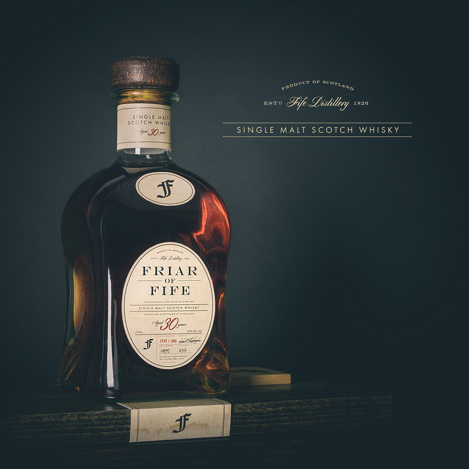
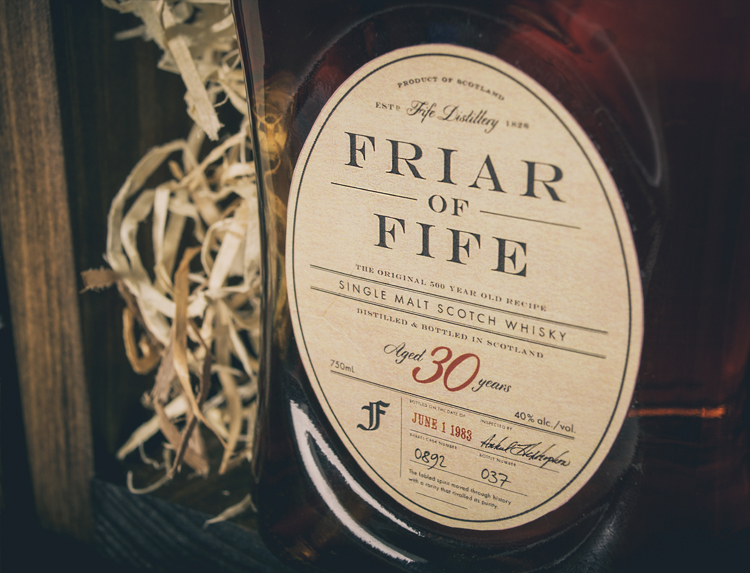
Scotch whisky spoke to me as an incredibly intriguing product because of its primarily high-end nature and opportunity for creative packaging, but even more so because of the beverage’s fascinating history and cultural relevance. Because there is no shortage of phenomenal Scotch packaging designs in the marketplace today, I decided to create a fictional distillery and brand that encompassed my vision of telling the story of whisky’s origins in Scotland.
The following is the tale of Friar of Fife.
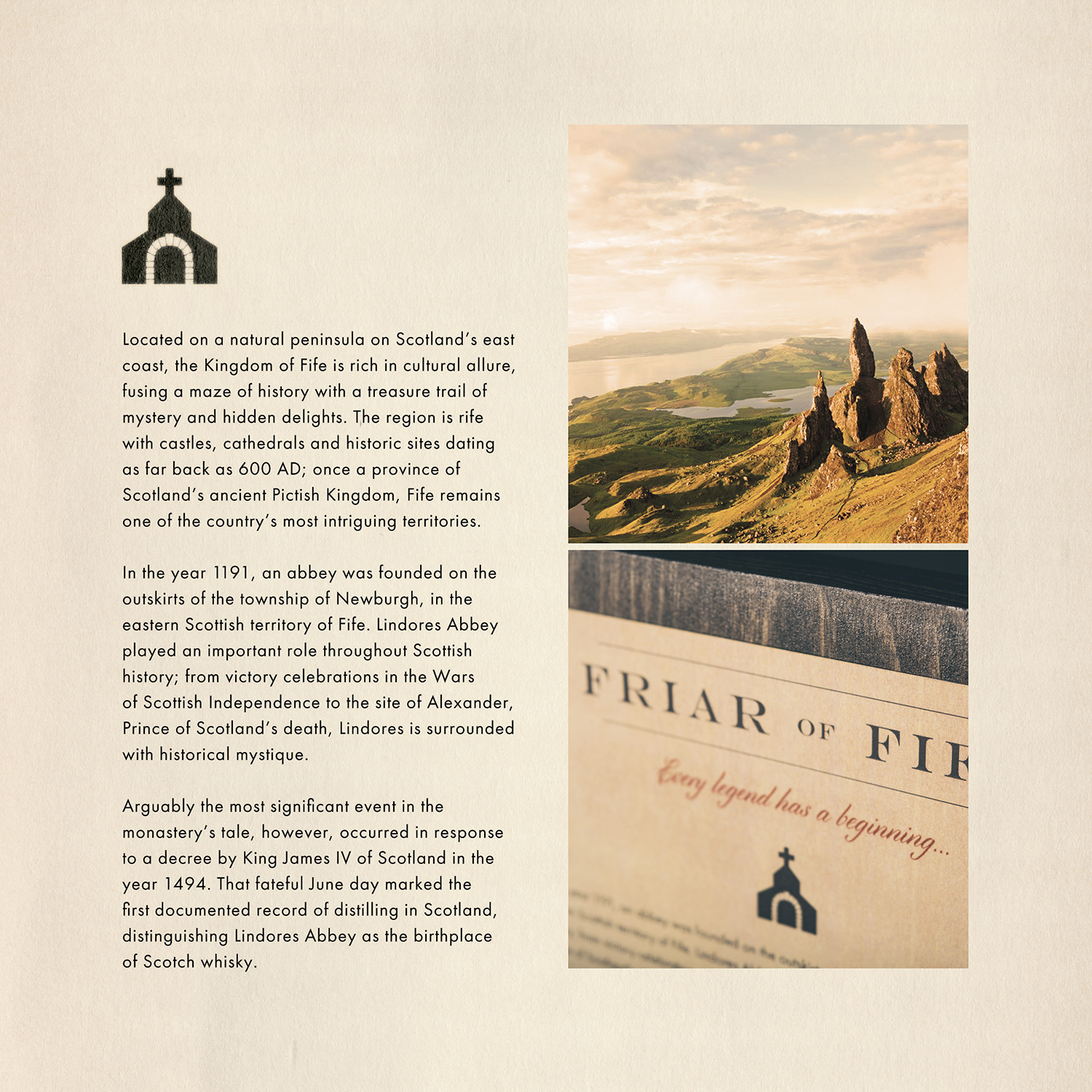
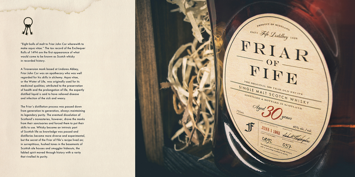
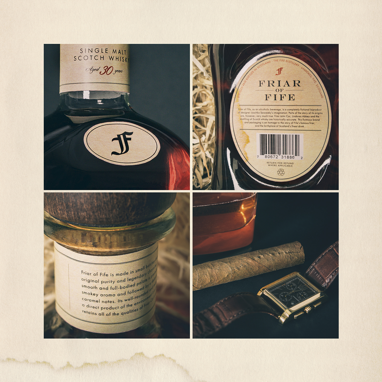
My main goals with my packaging design was first to begin to gain an understanding of Scotch whisky, and then to pay homage to its origins and history throughout my design. The beginning of the story is all true fact: the name Friar of Fife is derived from the man who is accredited with the first mention of distilling whisky in Scottish recorded history, Friar John Cor of Lindores Abbey. The small monastery in the eastern Scottish territory of Fife was home to alchemist monks like Friar Cor, who used whisky for its believed medicinal properties. Then called Aqua Vitae, or Water of Life, the spirit was eventually passed onto others outside of the monasteries, and quickly gained popularity among the people of Scotland.
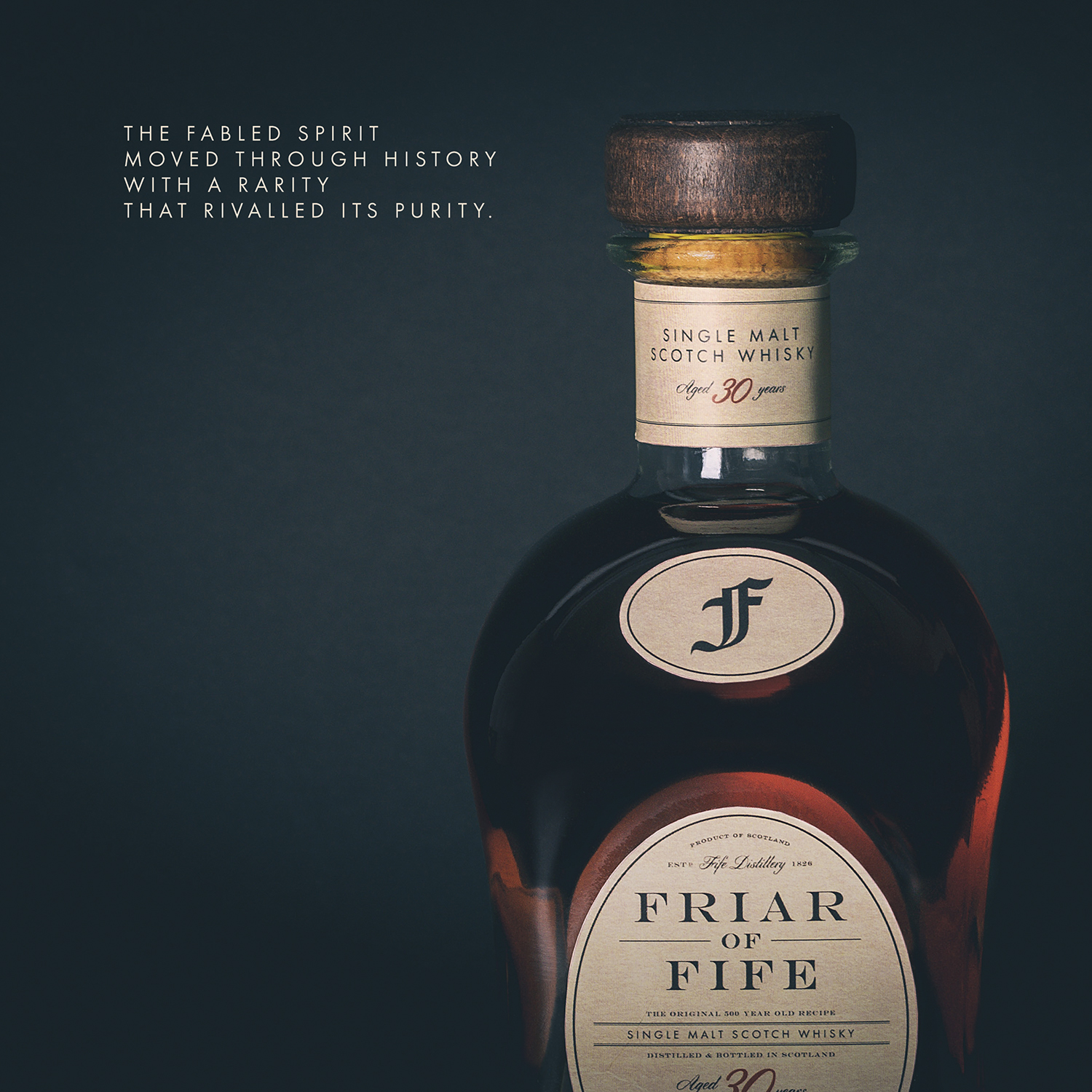
From here, I went on to take a more fictitious route with how the spirit moved through history, followed by the eventual origins of the imaginary Fife Distillery. Putting a mysterious spin on Friar Cor’s original recipe allowed me to bring a much higher level of intrigue to the story, positioning the legendary Friar of Fife Scotch as the utmost in quality, purity and rarity.
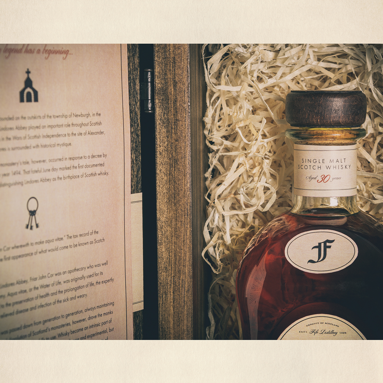
When it came to conceptualizing ideas for how to present the packaging, my immediate thought was to use a different material than the standard card stock box that many other bottles of alcohol come in. I wanted to accentuate the high-end aspect through a component that also represented strength, refinement and just enough ruggedness—a visual metaphor of the target customer demographic.
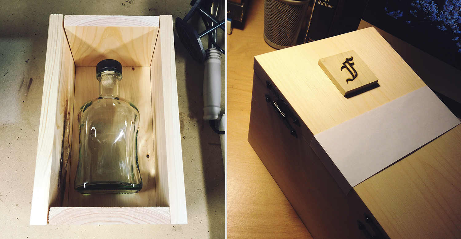
Wood came easily as the best fit for the job; not only did it meet the criteria I had set, but it also provided a means to achieve one of the overall end goals I set out to accomplish with my package design in the beginning. A sturdy wooden box is far less likely to be thrown away than something like a cardboard box or tube; it presents the opportunity to be repurposed into a storage container, display case, or simply a mantlepiece with a great story behind it.
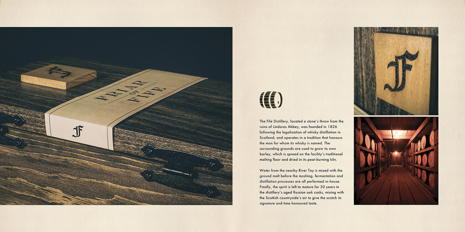
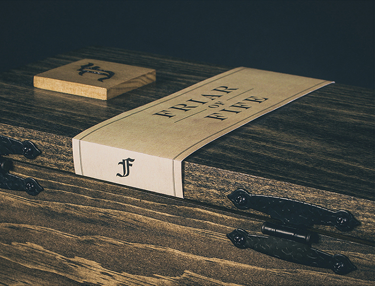
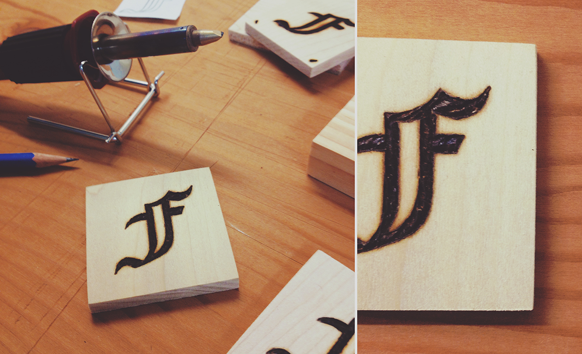
My good friend Alex (the talented man behind Handmade by Hicknell) helped me bring the box to life. We embellished the outside of the box with a pair of fittingly rustic hinges, as well as a wooden badge on which I burned the product’s logo onto using my latest toy, a wood burning pen. This provided the box with a simple yet elegant and intriguing exterior that beckons one to come closer and uncover its contents.
The end result turned out even better than I’d hoped, and now rests on my office bookshelf as a reminder of one of my favourite projects I’ve worked on to date.
— J
Oct. 28 2018

